Somewhere between the slab going down and the plasterboard going up, every Australian homeowner gets asked the same question: warm white or cool white? It usually arrives as a line on an electrical selections sheet, or a three-position switch on the back of a downlight, and it usually gets answered in about four seconds.
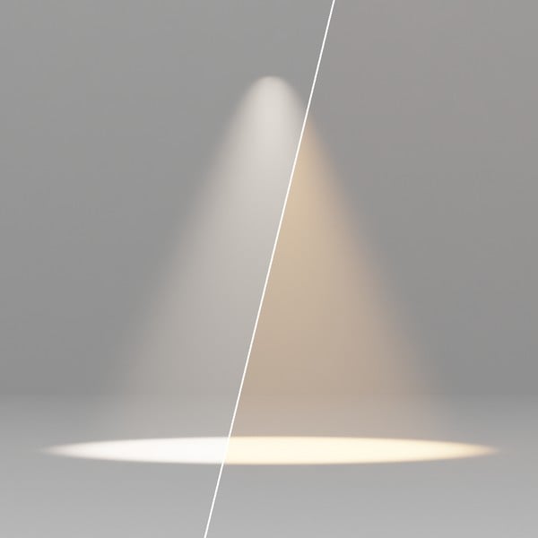
It deserves longer. Colour temperature changes how your timber, stone, paint and skin look every night for the next twenty years. Our answer is simple: we fit 3000K in almost every room we light. Here is the difference, side by side.
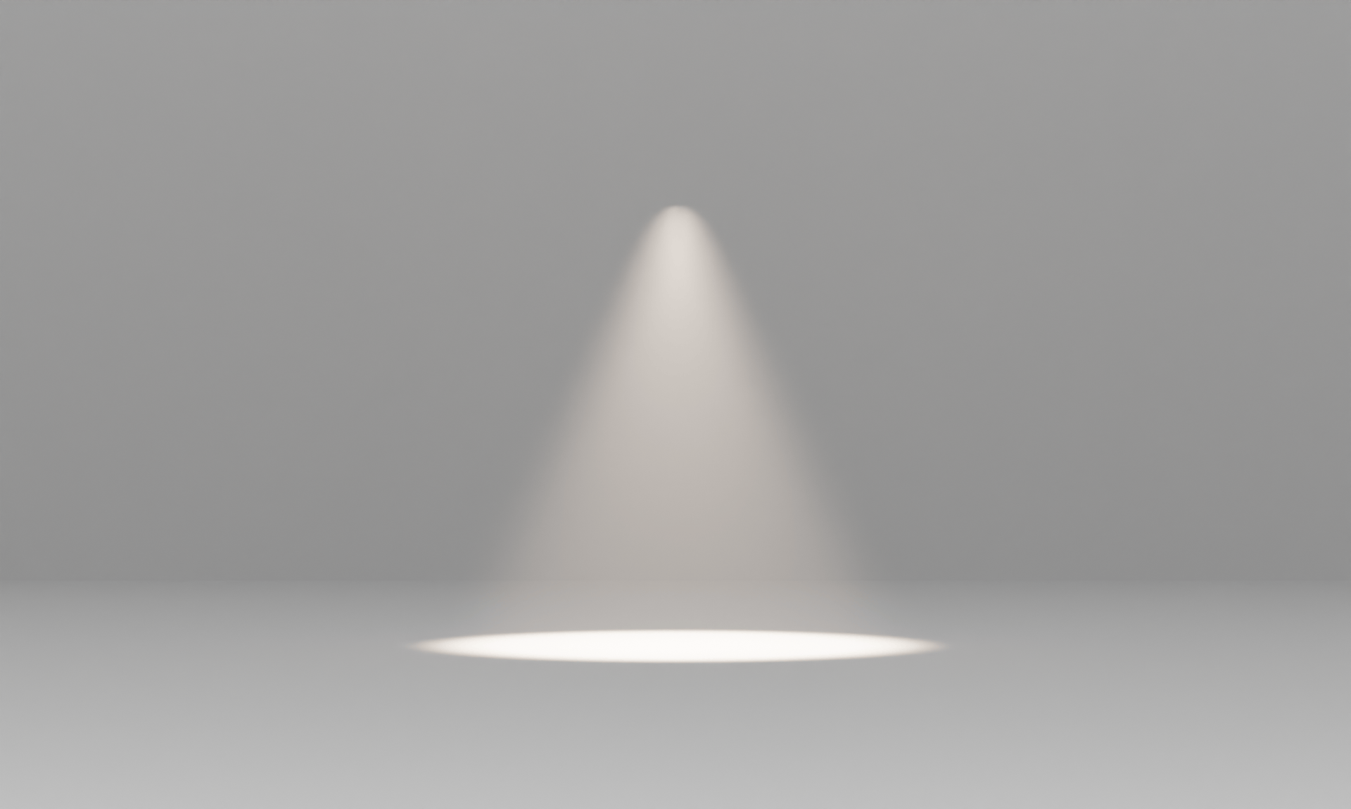
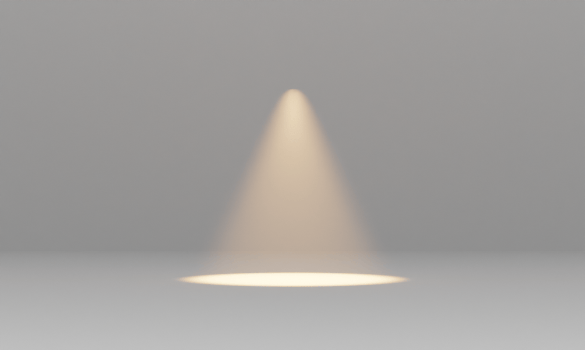
4000K Cool white3000K Warm white
Same fitting, same beam, same output. The only thing that changes is the white.
Colour temperature is measured in Kelvin (K). It describes the colour of white light, not how bright it is. Lower numbers are warmer and more amber; higher numbers are cooler and bluer.
Kelvin
Usually sold as
What it looks like
Where we use it
2700K
Warm white
Amber, close to an old incandescent globe
Rarely. In a downlight it reads orange
3000K
Warm white
Clean white with a hint of warmth
Almost every room in the house
4000K
Cool white or “natural”
Neutral to slightly blue
Garages, workshops, closed utility rooms
5000K to 6500K
Daylight
Blue-white, like a supermarket
Not in a home
Why not 2700K? It’s the number many overseas guides recommend for living rooms, and it’s why so many Australians land on it. In our experience it’s simply too orange under a ceiling full of downlights. Whites go cream, blues go muddy, and the room starts to look like a photograph from 1985. 3000K gives you the warmth without the tint.
“But 4000K Is Brighter”
This is the single biggest reason people choose cool white, and it’s mostly an illusion. Brightness is lumens, not Kelvin. Our Pro Round G3 at 13W puts out 1400 lumens at 3000K and 1500 lumens at 4000K. That’s about 7 per cent, a difference most people can’t pick in a real room.
What you can see is the colour. Blue-white light reads as crisp in a bright showroom at midday. At 8pm in a living room, the same light reads as an office. If a room feels dark, it needs more light, or better-placed light. It doesn’t need bluer light.
Room by Room
Room
Our pick
The reason
Living and dining
3000K, dimmable
Flatters timber, fabric and people; dims gracefully
Bedroom
3000K, dimmable
Warm without being amber; dim it right down at night
Kitchen
3000K
Open to the living areas, so it must match them
Bathroom
3000K, 92+ CRI
Colour accuracy at the mirror matters more than Kelvin
Hallways and stairs
3000K
They connect rooms; they should look like them
Home office
3000K
4000K only if it’s closed off and used in daylight hours
Laundry and scullery
3000K
If either opens onto the kitchen, it’s part of the kitchen
Garage and workshop
4000K
The one room where clinical is the point
Alfresco and garden
3000K
Cool white outdoors makes a home look like a car park
What colour temperature for a kitchen?
3000K. This is the room where we disagree most often with standard inclusions. Kitchens get 4000K because they’re “task areas”, but in nearly every new Australian home the kitchen is the middle of an open-plan living space. Put 4000K over the island and 3000K over the sofa and you’ll see the line where one ends and the other begins every single night. Task lighting is solved by where the light goes, over the bench rather than behind your head, not by turning it blue. Our lighting plan guide covers that positioning.
What colour temperature for a bathroom?
3000K, and pay more attention to CRI than to Kelvin. Colour Rendering Index measures how accurately light shows true colour. The industry standard is 80 CRI, which leaves skin looking grey and makeup looking wrong. We specify 92+ CRI as standard, and the Pro Adjustable reaches 97+. If you do your makeup or shave at that mirror, this is the number that matters.
What colour temperature for a bedroom?
3000K, on a dimmer. The bedroom is the room where you’ll want the least light, so the fittings need to look good at 10 per cent as well as at full. If you want something warmer for the last hour of the day, that’s the job of a lamp, not the ceiling. Decorative pieces like Panzeri’s Auriel, which switches between 2700K and 3000K, are where a touch of amber earns its place.
Four Rules
One white per sightline. If you can see two rooms at once, they need the same colour temperature. Mixed whites in open-plan living is the most common mistake we’re asked to fix.
Match your decorative and architectural lights. A 3000K pendant hanging in a 4000K grid looks like a mistake, because it is one.
Set the tri-colour switch once. If your downlights have a 3000K / 4000K / 5000K switch, set every one to 3000K before the electrician packs up, and never touch it again. That switch is there so a wholesaler can stock one product, not so you can redecorate with it.
Want a warmer evening? Dim, don’t swap. A good 3000K downlight dimmed to 20 per cent feels warmer than any 2700K at full power. Our FAZE drivers dim smoothly down to 1 per cent, which is why we don’t need a second colour on the ceiling.
See It Before You Choose
Kelvin numbers on a selections sheet don’t look like anything. The Light Lab lets you switch 3000K against 4000K, and 92+ CRI against 80 CRI, across four real rooms. Every image is a true render, not a filter.
Better still, see them lit. Our showroom has the Pro Series running at both temperatures side by side. Talk to one of our lighting consultants before your electrical selections are due, or browse the FAZE downlight range.